

HIBANAPAY
A Clear, Confident Way to Get Paid
A full end-to-end design of a next-generation payments platform built on open banking, intuitive QR transactions, and effortless money management. Designed for small businesses, independent creators, and modern users who want secure, affordable, and friction-free payments without the complexity of traditional banking or costly POS systems.
Project Overview
Role: UX/UI Designer, Product Researcher, Design System Lead.
Timeline: 12 months.
Team: Collaborated closely with the founders, engineers, and product stakeholders to bring the HibanaPay vision to life.
The Challenge
HibanaPay set out to rethink how small businesses and individuals handle everyday payments. Traditional POS systems were expensive, slow to set up, and difficult to operate. At the same time, peer-to-peer transfers lacked clarity and trust, especially when tied to open banking. Users wanted a simple, secure, and affordable way to get paid without the friction of legacy financial tools. The challenge was to design a platform that reduced complexity, increased confidence, and brought modern payment flows to life in a way that felt genuinely approachable.
The Goal
Redesign and shape the product to be:
-
Instantly clear and intuitive
-
Trusted and secure through open-banking patterns
-
Fast for both businesses and customers
-
Visually unified across web, mobile, and kiosk experiences
-
Flexible enough for future features while still MVP-ready
What I Delivered
-
Full end-to-end product design for web, mobile, and kiosk
-
New UX flows for onboarding, QR payments, P2P transfers, and payment management
-
A friendly yet credible HibanaPay visual identity inspired by the “spark” concept
-
A scalable design system (tokens, components, theming) usable across platforms
-
High-fidelity prototypes tested with real users to validate clarity and trust
-
MVP-scope final UI optimized for simplicity, security, and accessibility

User persona

Age: 32
Role: Hair Salon Owner
Tech Level: Medium
Bio
Lena runs a small but busy hair salon and spends most of her day moving between clients. She doesn’t have time for complicated payment systems or expensive POS terminals. She needs something fast, reliable, and easy to use — a tool that lets clients pay smoothly so she can stay focused on providing great service. She values technology that feels simple, secure, and doesn’t interrupt the flow of her work.
Goals
-
Accept payments instantly without leaving the workstation
-
Reduce costs by replacing traditional POS terminals
-
Keep track of daily earnings and transactions effortlessly
-
Offer clients an easy, modern way to pay (QR, open banking, etc.)
-
Build trust with a professional, streamlined payment experience
Motivations
-
Deliver a smooth, stress-free checkout experience for clients
-
Spend more time with clients, less time managing admin
-
Use tools that make the business look modern and trustworthy
-
Keep business operations simple, organized, and tech-friendly
Pain Points
-
Traditional POS systems are expensive and slow
-
Switching between tools interrupts her workflow
-
Card readers fail or take too long to connect
-
Tracking income across different payment apps is confusing
-
Clients expect quick, seamless ways to pay — especially younger ones
USER PERSONA
Lena, The Salon Owner
"I don’t want complicated systems. I just want something simple, reliable, and professional."
Research Insights
Methods Used
-
User interviews
-
Surveys
-
Competitor analysis (Zettle, SumUp, Revolut, bank apps)
-
Persona creation (small business owners + P2P users)
-
Usability testing on early QR payment prototypes
What I Found
-
Small business owners want simple, low-cost payment tools without POS complexity.
-
QR payments must feel instant, secure, and trustworthy through open banking.
-
Users want clear feedback when a payment succeeds or fails.
-
People prefer fewer steps fast flows with no friction.
-
Design needs to feel friendly, modern, and not “bank-like.”
What I Found (P2P Users)
-
Users enjoyed fast, expressive payments for shared expenses.
-
The old flows lacked clarity around who pays, when, and how much.
-
Trust increases when the UI clearly shows amounts, status, and confirmation messages.
Personas
-
The Salon Owner: Needs quick, reliable payments during busy client work; wants to reduce POS costs, interruptions, and setup friction.
-
The Social Splitter: Sends and requests money often; wants fast, simple interactions and instant clarity when settling bills.

Key Findings
1. Payments must feel instant and interruption-free.
Small business owners need flows that don’t disrupt their work.
Two taps max no terminals, no long steps.
2. Clarity builds trust in open banking.
Users hesitate during bank-linking or first payments.
Clear wording, progress indicators, and confirmations greatly increase confidence.
3. Businesses need simple QR flows that work every time.
QR payments must scan quickly, load instantly, and provide immediate “Payment Successful” feedback.
4. Users want transparency: who paid, how much, and when.
Whether in a salon or splitting a bill, users want to see real-time status and avoid confusion.
5. Existing tools feel too complex or too formal.
Many apps resemble traditional banking, creating friction — especially for small business owners with low tech affinity.
6. Friendly, human interactions increase adoption.
Warm design, simple language, and clean UI patterns make the experience feel approachable and trustworthy — essential for open banking payments.
We reached out to a mix of small business owners and frequent P2P users to understand their real payment challenges. Salon owners, barbers, and independent freelancers shared how traditional POS tools slow them down, while younger users explained their need for fast, simple, and trustworthy payment flows. Through interviews, short questionnaires, and early prototype testing, we gathered clear insights into their frustrations, habits, and expectations. These learnings shaped our key findings and guided the early direction of HibanaPay’s design.

3 core problems
1. Payments interrupt the flow of work for small businesses.
Salon owners and barbers lose time switching between tools, handling devices, or waiting for POS systems to connect. Payments must be fast, reliable, and hands-free, without disrupting the service experience.
2. Essential open-banking flows feel complicated and unclear.
Users hesitate when linking their bank or confirming payments because steps feel long, technical, or unfamiliar. Clear language, simple screens, and instant feedback are needed to build trust and confidence.
3. Tracking payments and earnings is scattered across too many apps.
Business owners struggle to keep an overview of their daily income, client payments, and transaction history. Users want one place to see what’s paid, pending, or failed — without spreadsheets or manual checks.
From Insights to Direction
This section showcases how raw insights user feedback, pain points, operational workflows, and payment journeys were transformed into strategic guidance for the HibanaPay product. These findings defined our personas, clarified our core problems, and shaped the functional and emotional goals of the app.

High-Level User Journey: From Signup to Daily Payment Operations
This diagram breaks down the end-to-end journey of a HibanaPay merchant, from creating an account to managing payments and reviewing financial data. It visualizes the user’s goals, actions, and emotional touchpoints across key moments in the experience — setting up requests, accepting payments with QR or kiosk mode, and viewing daily earnings. By mapping this flow, we identified where merchants feel confident, where friction emerges, and where the platform can offer stronger guidance or automation. These insights helped refine the onboarding steps, simplify payment tools, and improve the clarity of HibanaPay’s financial dashboard.

Mapping Billing & Subscription Flows Across Web and App
This flow visual illustrates how we structured HibanaPay’s billing and subscription journeys across both the browser and mobile app. By mapping cancellation paths, plan upgrades, invoice handling, and open-banking–related steps, we identified areas where users experienced friction or confusion. Aligning these flows helped ensure consistency between platforms, simplified edge cases like failed payments or exceeded limits, and clarified the overall subscription experience. These insights informed a more intuitive billing system that supports small businesses and reduces customer support overhead.

Mapping Key Benefits Across Customer Segments
This workshop visual captures how we grouped the core benefits of HibanaPay across different customer types Personal, Standard, and Enterprise. By clustering insights from research, stakeholder interviews, and early product explorations, we identified which value propositions resonate most with each segment. Themes like saving on fees, instant payments, easier cash-flow tracking, and reduced admin emerged consistently. This grouping exercise helped refine our pricing tiers, clarify our messaging, and ensure each plan intentionally supports the needs of small businesses and independent users.
Account Setup & Onboarding
A unified look at how users join HibanaPay, set up their accounts, manage details, and customize receipts across mobile and desktop.

Onboarding & Account Creation Flow
These screens illustrate how new users are introduced to HibanaPay, covering the full onboarding experience: creating an account, verifying email, selecting a plan, entering business details, and signing in. The goal was to make the process feel effortless through concise messaging, predictable steps, and support for modern authentication methods like magic links and Apple/Google login.
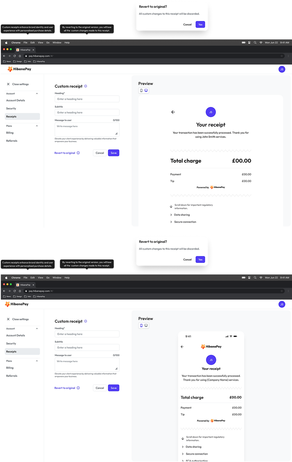
Custom Receipt Builder
To help merchants deliver a more polished customer experience, I designed a customizable receipt editor with instant previews and straightforward editing fields. The flow includes a reversible confirmation pattern, supporting user confidence while preventing accidental loss of work. This feature strengthens brand identity and enhances transparency in every transaction.

Team Invite & Account Setup Flows
This section showcases the complete desktop and mobile flows a new team member sees after being invited to HibanaPay. It includes the empty-state dashboards, account-details setup, and security configurations. These screens highlight how the experience was designed to guide new users with clarity, reduce friction, and ensure that essential account information is completed smoothly across all devices.
Motion & Video Design
Showcasing the motion graphics and promotional videos I created for Hibana, highlighting my skills in video editing and visual storytelling.
Reflection & Learnings
What Worked Well
-
Expressive UI elements made payments feel warmer and more human.
-
Users found the payment flow simple, friendly, and easier than typical banking apps.
-
Breaking onboarding into small steps improved clarity and reduced friction.
-
Early prototypes aligned the team quickly on flow and hierarchy.
-
Clear design language increased confidence during sensitive steps like bank linking.
What I’d Improve Next
-
Add deeper personalization for merchants (themes, stickers, branded elements).
-
Further simplify open-banking linking and improve error recovery.
-
Test group and shared payment flows with real users.
-
Measure long-term engagement to understand how expressive design impacts retention.
-
Continue refining onboarding to support more business types and faster setup.